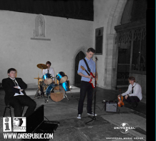
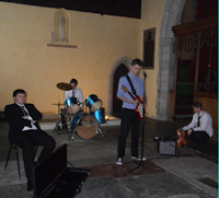
 This is the image we used on the inside left cover of the digipak. It is a flipped image of the band that we took during our photoshoot at the church. We felt that the perspective of the shot worked well for this panel and it also includes the whole band like the front cover.
To create this final image I went through a number of steps. The first step was Shrinking the image so that it would be the right size on the digipak. Unfortunately, the original image only just encapsulated the whole band, length-ways which meant that I could not crop it to the right size. Because of this, once I'd shrunk the image it was too short for the panel. To correct this I used the clone stamp tool to elongate the wall and the arch at the top of the image.
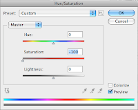
 The next effect that I added was the desaturation of the background. I did this by carefully selecting each of the band members with the polygonal lasso tool on '+' setting and then pressing cmd+shift+i to invert the selection. After this selection was made I went to the image toolbar --> Hue/Saturation and moved the saturation slider over to '-100'. This desaturated the background whilst leaving the band members (and their instruments) in colour.
 After this I begun to add the record label icons to the bottom of the image. These were added to make it look more professional and because it seemed to be a convention on many digipaks that exist. These were the same icons that were used on the back panel of the digipak and we also included the band's website. The icons were placed on the bottom of the image and in the corners as they were not the main focus point of the panel.
To the right is the original image for reference.
No comments:
Post a Comment