Thursday, 8 March 2012

Final Digipak


This is our final digipak design. The bottom left and top right panels are shorter than the other two as they will appear on the lid of the digipak (although I included the sidebar on the top right image in order to show what it would look like with the behind inside cover).

Monday, 5 March 2012

Final Cut Feedback


All of the A2 media students got together to give feedback on each group's final cuts. Comments were written down on pieces of paper and then handed to the respective group. Comments about our video are shown in the image below.
Comments about our video were almost completely positive. The main points outlined were:
  • Good lip syncing to the lyrics and well-timed editing.
  • Effective use of close-ups and shots of instruments.
  • Eye contact with the singer amplifies the listeners connection to it.
  • Good use of shot transitions.
  • Well done extreme close-ups on the singer's lips.
  • Nice variety of shots for all band members.
  • Effective use of camera movement.
The few negative comments we received mainly mentioned about changes to the lighting in the shots. This was due to the fact that we were using, for the most part, natural light and as the day went on it did become darker.

Sunday, 4 March 2012

Final Digipak - Panel 4 Construction


On the right is the image that is on the inside cover behind the CD. It features an image of the light bulb that we used in our final cut but edited for a better effect. Below is the original image and you can see how much difference the changes made to the final image.

Firstly, I flipped the image so that the bulb was on the right. This was so that the light being emitted from the bulb didn't look odd when positioned next to the other inside cover.

After this I worked on the quality of the image. The original was very grainy and had a dull look to it. To enhance it I first used some image adjustment sliders including Brightness/Contrast and Hue/Saturation. With these I made the dark parts of the image darker and the lighter parts, lighter.

After this I decided to crop the image to the size I needed for the digipak before I made permanent changes to the image. I cropped off the arch-door (on the right) which made the image completely focused on the bulb and the darkness behind it for added symbolism (a lone light in the dark --> secrets).

Lastly I wanted to get rid of the grainy effect on the image. I did this with the dust and scratches filter. The dust and scratches filter blurred the image and in doing so, removed the grainy texture from it.

Friday, 2 March 2012

Final Digipak - Panel 3 Construction

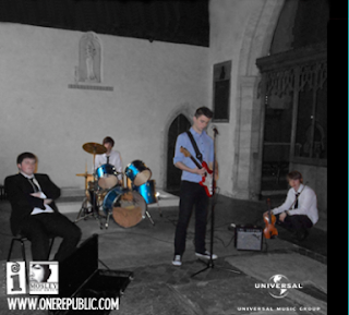
This is the image we used on the inside left cover of the digipak. It is a flipped image of the band that we took during our photoshoot at the church. We felt that the perspective of the shot worked well for this panel and it also includes the whole band like the front cover.

To create this final image I went through a number of steps. The first step was Shrinking the image so that it would be the right size on the digipak. Unfortunately, the original image only just encapsulated the whole band, length-ways which meant that I could not crop it to the right size. Because of this, once I'd shrunk the image it was too short for the panel. To correct this I used the clone stamp tool to elongate the wall and the arch at the top of the image.

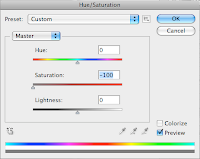
The next effect that I added was the desaturation of the background. I did this by carefully selecting each of the band members with the polygonal lasso tool on '+' setting and then pressing cmd+shift+i to invert the selection. After this selection was made I went to the image toolbar --> Hue/Saturation and moved the saturation slider over to '-100'. This desaturated the background whilst leaving the band members (and their instruments) in colour.

After this I begun to add the record label icons to the bottom of the image. These were added to make it look more professional and because it seemed to be a convention on many digipaks that exist. These were the same icons that were used on the back panel of the digipak and we also included the band's website. The icons were placed on the bottom of the image and in the corners as they were not the main focus point of the panel.

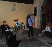
To the right is the original image for reference.

Thursday, 1 March 2012

Final Digipak - Panels 1 and 2 Construction


I designed panels 1 and 2 at the same time for this idea. The reason for this is that I think they need to flow nicely together as they are both on view (eg on a store shelf) and because when the digipak is opened they can be seen together.

For this idea I wanted to include a black and white theme to the piece. This was because this colour scheme is a common trait in digipaks of the same genre (examples to the right). I also wanted to include the idea of the dove images but with less focus given to them and more on images of the band itself.

Firstly, we produced a penciled sketch of what we wanted it to finally look like. This pencil sketch acted as a guide throughout the creation of the panels and although many things were changed up to the finished products, the resemblance is still visible to it.

We used an image that included all of the band members looking at the camera. We played around with a few different photos but we decided to keep with one using the same layout as in our plan. We chose this one as the photo was well shot, the band members looked well set up and it fit on the panel in a way that allowed us to create a good composition.

After cutting out the photo and positioning it, I added the band's name and the title of the album. I used the same graphics that I'd already made for my other album cover designs so this was a simple task.

Next, I added the doves. These were also taken from some of my previous designs as I could easily access the doves, one by one by selecting the individual layers for each one. I then used cmd+T to transform each dove into the position and size that I wanted. Originally on the sketch we'd planned to have the doves above the band members but when I tried it on the final draft, it didn't look very good as the band members already took up most of the cover and moving them down looked odd. Instead, I put the doves on top of the band members. This effect worked well and we decided to leave it like that.


For the back cover, in order to keep with the conventions of other CDs, we had to include a contents list for the songs that appear on the album. We already had the name for our album, 'Letting Go', so we had to choose songs that work well with that title so that it can be justified. Luckily, most song titles are vague and may not even make sense so this was not a difficult task. I used the same font as what I used on the album title and band name on the front cover. This was to promote a synergising look across the digipak.

After the contents were made I positioned them to the side of the panel in the same way as the sketch. The next part that I had to work on was the copyright text. I looked at a number of existing CDs to see what kind of information appears in this section and wrote an appropriate passage for our particular song and band.
I then found the company logos for each of the companies involved in the product and placed them on the cover.

Magazine Advert - Research and Planning

As we are working on the digipak we have some time to also do some research for the next ancillary task, the magazine advert. We are doing this as it will save time and it will allow us to create a closer synergy between our products (since we are doing both around the same time). As with any research, the first thing we had to do was to look into were existing products. We looked at some music magazines that we had from last year's project (Kerrang!, Q and NME) and searched the internet for examples. The following image shows a few of the examples that we found that were particularly useful for us:

From these and other covers some of the conventions of magazine adverts were made clear.
  • Use of black and white is frequent and appropriate in many situations.
  • Another colour can be added if it suits the particular image or album being shown.
  • Large text is used to outline the album and band names (more than anything else).
  • Icons and web addresses are added when appropriate and at the bottom of the page.
  • The image dominates the page.
  • The image that dominates the advert can be different to the front cover of the CD being advertised although an image of the CD can be added to the page.


These are our first designs for the magazine advert. We made the designs with close attention to the examples of existing adverts and featuring images that we already have. In keeping with the established forms and to synergise with our digipak, both of the adverts are planned to have a black background and include white text. The second idea will have a splash of red in the colour scheme as taken from the red of the guitar. Both adverts use large fonts to outline the band name and the album title, as well as an emboldened release date which does appear on the Bob Dylan advert shown above. In the second advert, the image dominates the page but in the first it is a bit small, this will probably be changed when we finalise the designs on photoshop.

We chose to use different shots from those we used on the digipak as they seemed more fitting but we also included an image of the digipak cover on the second advert.