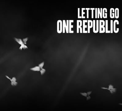
 In this post I will explain how I created this cover without the use of photos.
First of all, I created the background. This was a four step process:
- Setting the canvas dimensions to the average digipak dimensions and filling it black with the fill tool.
- Leaving the foreground colour as black and setting the background colour to white, I went to filter--render--clouds to create a cloudy effect and then pressed ctrl+J repeatedly to re-render until I was happy with the result.
- At this point I created a layer mask on the cloud layer and then filled the mask with a gradient at the top and bottom of the screen in order to mask out the clouds gradually and leave the misty effect in the middle of the image.
- After finishing the clouds I wanted to add some rays of light coming through. To do this I made a box using the rectangular marquee tool and filled it with white. Then I used the eraser tool with hardness at 0% to shave the edges down into rays of fading light. Then I used ctrl+T to transform it and turn it into position. To create the other rays I copied the original ray's layer with ctrl+J and used transform to move them into place and adjust size.

After the background was finished I moved on to the doves. I didn't have any good photos of doves so I searched online for some brushes that I could use. The only one I could find online is from a DeviantArt user, LithiumStock.  The brush set included only 3 brushes with realistic brushes of doves but I decided to give it a try anyway. I imported the brushes into photoshop and begun to add them to the image. At first, the brushes looked a little odd so I blurred and added a glow to them to give them a shining effect that worked well. I made it look like I had more than 3 brushes by subtly changing them with the use of opacity, orientation and use of the paintbrush tool.
Lastly I needed to create the title. I made a separate document for this as I will be using the title graphic across all of my designs. I used a free font that I found on DaFont.com called Headline Two. It was adapted from a newspaper headline font that was used in the 1920s and 1930s and looks perfect for One Republic to continue in the themes of their previous fonts and fitted well on the cover.
No comments:
Post a Comment