Wednesday, 29 February 2012

Digipak Designs - Vector Imaging

Now that we have the photos from the our secondary shooting time I have begun to put some more digipak ideas together including some interesting artistic designs.

I wanted to experiment with an artistic style called vector imaging. Since I had not tried anything like this before I decided to make the first cover using a non-human image. After looking through some pictures that we took at our second shooting I chose to use a picture of the lead singer's guitar. I chose this picture as I thought I could make an interesting effect with it looking like it continues into infinity.

To make these images is fairly simple really. The only equipment I used were background images and a few simple Photoshop tools. Firstly, the background images were cut out and altered using adjustment filters to look bright and vibrant. After that I began to select areas of block colour with the polygonal lasso tool and fill them with the fill tool using colours taken from the background image. Most of the image is done in this way giving the image its cartoony look. I made a few changes to the final image that weren't on the original such as the shines both on the lower left of the guitar and on the black plug of the guitar.

In the end, we decided not to go with these style of designs for the digipak as it doesn't effectively reflect the genre of music that we are trying to promote.

Friday, 17 February 2012

15th Feb - Third Shooting, Finished!

A couple of days ago we went back to the church and using the feedback that we received from our rough cut, we did some re-filming in order to get the shots that we need for the final cut. The day was another success and we now have the footage to complete our video. We also got a wealth of photos to use for our ancillary tasks.

Thursday, 9 February 2012

Digipak Designs

Using ideas from my mind map I have begun to make some possible digipak cover drafts.

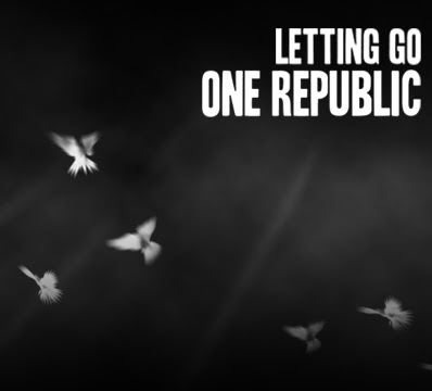
On the right are my first 6 attempts and combinations. The photos I used of the cello and candle were taken at the church when we filmed there and the doves are a custom brush that I altered in order to fit my requirements.

In order of completion:
  • Middle right
  • Bottom right
  • Middle left
  • Top right
  • Top left
  • Bottom left

The doves cover (middle right) was my original idea and I experimented with it across the other ideas. Check my previous post to see the specifics of how I created it. For the other ideas I used photos that I'd taken whilst we were at the church for filming. To make these ready for use on the covers I cut them from their original backgrounds and adjusted vibrance/contrast/brightness/saturation levels to optimum levels.

For the original candle cover (top left) I overlayed the dove cover on top to create the misty effect and to see how it would look. For the second candle cover I wanted to make the doves look like they are flying out from the candle. To do this I used the brush again and transformed it so that I could change the direction of the birds. I didn't really like the end product of this attempt and it didn't really create the effect I was hoping for.

The cello covers are much more conventional and I decided to leave them fairly simple. The title of the album rests on top of the bow of the cello as if it were underlined and it's white text contrasts with the dark gradient that I added to the top and bottom of the image. The bottom right and top right images are similar but for the top one I had made a few adjustments to lighting in order for the cello to have a greater effect and presence. I also overlayed the doves onto this cover (middle left) which I do like but I think I prefer the non-overlayed ones.

This is an idea that one of my team mates drew up after he saw my original dove cover. It includes ideas for the whole digipak and keeps consistent with the doves theme. However, we do not yet have the photos that would be necessary so we are going to have to wait until we do our secondary filming to get these.

Tuesday, 7 February 2012

Doves Cover for Digipak - Creation

In this post I will explain how I created this cover without the use of photos.
First of all, I created the background. This was a four step process:
  1. Setting the canvas dimensions to the average digipak dimensions and filling it black with the fill tool.
  2. Leaving the foreground colour as black and setting the background colour to white, I went to filter--render--clouds to create a cloudy effect and then pressed ctrl+J repeatedly to re-render until I was happy with the result.
  3. At this point I created a layer mask on the cloud layer and then filled the mask with a gradient at the top and bottom of the screen in order to mask out the clouds gradually and leave the misty effect in the middle of the image.
  4. After finishing the clouds I wanted to add some rays of light coming through. To do this I made a box using the rectangular marquee tool and filled it with white. Then I used the eraser tool with hardness at 0% to shave the edges down into rays of fading light. Then I used ctrl+T to transform it and turn it into position. To create the other rays I copied the original ray's layer with ctrl+J and used transform to move them into place and adjust size.

After the background was finished I moved on to the doves. I didn't have any good photos of doves so I searched online for some brushes that I could use. The only one I could find online is from a DeviantArt user, LithiumStock. The brush set included only 3 brushes with realistic brushes of doves but I decided to give it a try anyway. I imported the brushes into photoshop and begun to add them to the image. At first, the brushes looked a little odd so I blurred and added a glow to them to give them a shining effect that worked well. I made it look like I had more than 3 brushes by subtly changing them with the use of opacity, orientation and use of the paintbrush tool.

Lastly I needed to create the title. I made a separate document for this as I will be using the title graphic across all of my designs. I used a free font that I found on DaFont.com called Headline Two. It was adapted from a newspaper headline font that was used in the 1920s and 1930s and looks perfect for One Republic to continue in the themes of their previous fonts and fitted well on the cover.

Sunday, 5 February 2012

Rough Cut Feedback


Today we showed our rough cut to the class in order to get feedback to help when reediting and (for some parts) refilming. On the whole, our rough cut was well received with emphasis that our angles and editing were fairly good. The main point made was that our singer did not look directly at the camera very often which seemed a little weird when watching it. We had already realised this earlier in the process of making the rough cut and have already set another filming date (for the 15th February) to get more footage. This is the closest date we could get to re-film in the church.

Other points that were made included:
  • Opening shot looked wobbly.
  • A couple of out of sync shots.
  • Not enough shots of vocalist.